Running Dinner Planner
Planning Screen
The Graphical User Interface (GUI)
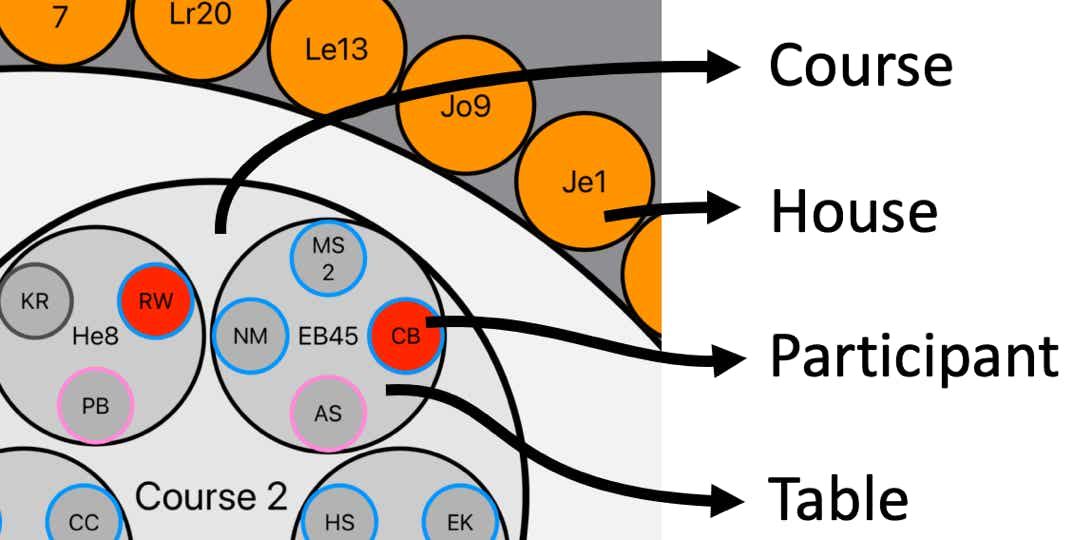
In this window a Seating Arrangement (aka a Configuration, or Solution) can be designed in an interactive and graphical way. From small to large, the various circles symbolise ….
1. (smallest): a Participant, with his/her ShortName inscribed.
2. a Table serving a Course that’s catered at a House, with its ShortAddress inscribed.
3. a House, with its ShortAddress inscribed.
4. a Table serving a Course catered for by a House, with the ShortAddress of the House inscribed.
5. a Course, with its Name inscribed
6. (largest): the Running Dinner Seating Arrangement as a whole.
A House can be assigned to a Course by simply dragging-and-dropping a House circle onto a Course circle, thus creating a Table-circle. The required Hosts (see Course definition) will automatically be dragged onto the Table. Likewise, Participants can be drag-and-dropped onto a Table to seat them there, or to another Participant to exchange places. If a move is not possible (e.g., because the maximum occupancy of a House has been reached, or because a House is not willing to serve a particular Course), the circle will move back to its original position when released.
Most circles can, for convenience, be rotated around their “mother-circle”. Zooming and panning is also possible by way of standard pinch- and drag gestures..
Colors
The various circles are sometimes colour-coded to indicate their status.
Participants (small circles)
Houses
Tables
Courses
The Penalty viewer
The Planner app uses various mathematical techniques to find the most optimal Seating Arrangement within the constraints provided by the user. These constraints come in the form of, for example, the number of Courses to be served, preferences for certain Houses to cater certain Courses, the number of Hosts required to be present when a House serves a Course, the maximum capacity of any given House in terms of room and number of Courses it’s willing to cater, the existence of so-called “Special Relations” between certain individuals (e.g., living at the same address). Moreover, it’s possible to force the Planner to only seek solutions where specific Houses are catering specific Courses, and where specific Participants are “pinned” to a specific Table in a specific Course.
The “most optimal Seating Arrangement” is defined in terms of the overall Penalty it receives due to, for example, Participants meeting more than once, Houses not serving their preferred Course, unbalanced male/female ratio at Tables, etc. (The value of these individual penalties can be changed by the user so as to steer the operation of the Planner in a desired direction - this is however an advanced feature that should be handled with care).
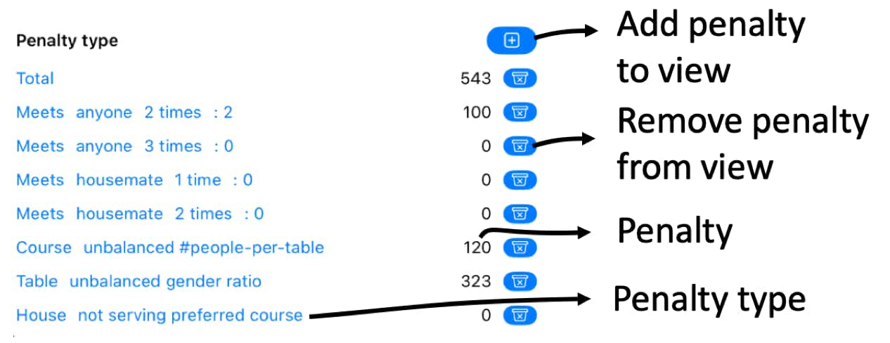
In the lower part of this screen, the Penalties given to the displayed Arrangement can be viewed. They fall into 4 categories:
The Penalty viewer offers an instantaneous evaluation of how “good” a configuration is. The user can add or remove the displayed Penalties from view. It should be realised that removing a Penalty from view does not mean the Penalty is not taking into account by the optimisation routines.
All blue fields in this (and other) section are clickable. For example, in below figure, the “anyone” on the 3rd line from the top can be clicked and changed into one of the defined Special Relations (e.g., “housemate”). Likewise, “2 times” can be changed as well. Finally, clicking on the last “2” in the second line from the top in below figure, will reveal in the Graphical User Interface (GUI) who actually meets who 2 times, and where.
The information banner
At the top of every screen a green bar is visible., with a screen-dependent middle section. On most all screens, the left-most button will take the user back to the previous screen, while the rightmost button pops up a browser with screen-dependent help.
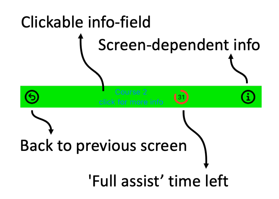
On this screen the middle section can, when one of the circle-entities in the Graphical User Interface (GUI) has been selected, be used to access details on the selected House, Table, Course, or Participant.
Although the Penalty View always reveals the quality of the displayed arrangement, any auto-generated arrangements shown in the GUI will remain locked (
The command bar
Inbetween the Graphical User Interface (GUI) and the Penalty View sits the command bar (hover over the buttons to see the submenus that appear when pressing or force-pressing the buttons on the phone).
Favorites
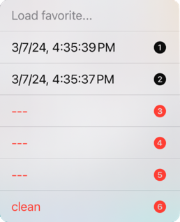
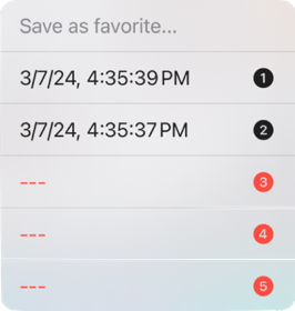
Next to the progress-indicator sit two buttons that can be used to store and retrieve arrangements of interest as favorites. There are 5 slots available. Pressing the “Store as favorite” button shifts all stored favorites one place up and inserts the displayed arrangement on the first position. Force-pressing this button allows the user to select in which of the 5 slots to store the displayed arrangement. Likewise, pressing the “Load favorite” button causes the favorite stored in the first slot to be loaded to the viewer, while force-pressing the button allows the user to pick which of the favorites to load. Note that this menu also offers the opportunity to load a “clean” or empty arrangement.
Auto-generated solutions
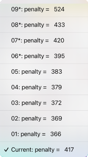
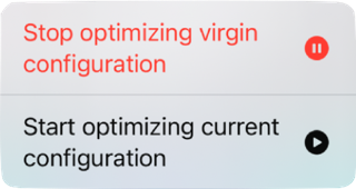
Arguably, the most important button of the entire Planner app is the “solutions” button on the far left. When the GUI screen is displayed, the app starts optimising both the current and the virgin configurations and stores them in memory. They can be accessed through this button - the “current” solutions (that honour the Houses that were dragged into position by the user as well as Participants “pinned” by the user) are marked with an asterisk. The calculations are quite power-intensive and the phone may get noticeably warmer; they will stop either by going back to the main workflow, pausing the calculations by pressing the progress indicator to the right of the “solutions” buttons, or by the app not finding solutions with a lower Penalty than those already stored.
It should be noted that the stored (maximum) 5 “current” solutions are thrown out once the user pins a Participant, or moves a House to a Course. Such actions tell the Planner that the “current situation” has changed, making the saved optimised “current solutions” invalid. The solutions are not thrown out if a user unpins a Participant or removes a House from a Course, since the saved optimised “current solutions” still match the “current situation” as shown in the GUI.
Partial assist
In Partial Assist mode, when the user selects a Participant to place next (its circle will turn white), the App calculates on the fly which Table the Participant is best placed on, i.e., which move would least increase the penalty assigned to the seating arrangement. The penalty, and its components, can be viewed in the penalty viewer. Since this involves some computations that slow down the GUI a bit, this mode can be turned off and on on the command bar in the Planning Screen - see figure. In addition to planning assistance, the Partial Assist mode also opens up the mail-merge functionality in the Invitations screen, with which personalised and customisable invitations can be generated in PDF and, if e-mail addresses were provided, be mailed to either the Participants or the organiser.
By purchasing Partial Assist, the above functionality becomes available to the user for a period of 31 days.
Undo and redo
Not sure if a certain move is the best one? Just try it out. The Undo and Redo buttons allow the user to easily go back to the previous state of the seating arrangement, and back again.
